For now the blog will focus on my university project but if i take to this whole 'blogging world' it will probably be a general blog of everything!
Friday, 5 November 2010
Mural
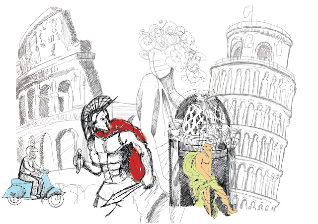
I think I like it...got to that stage where I have played about with it so much that I am sick of looking at it! Think I have managed to create a bit more depth which is what previous layouts lacked in. Not quite decided what aspects I will take through to the wine bottles etc.
Monday, 1 November 2010
Layout 2 for mural
This one (if we think it is the better of the two) will need more work on colour. Again any feedback would be very useful!
Friday, 15 October 2010
Friday, 8 October 2010
lets put pen to paper
So i know what style I am going to do and i roughly know what i am going to draw. Thought i would see how other people have tackled drawing rome and this is what i found...
Tuesday, 5 October 2010
Feel like i'm being followed... :$
I keep clicking on pictures when I'm searching for different things like geisha's or roman's and i keep being put through to PAPERFASHION... feel like they are stalking me.
http://paperfashion.wordpress.com/
http://paperfashion.wordpress.com/
My favourite...
Rebecca Wetzler Rebecca's Website
Now based in Melbourne, she has done work for Vogue Australia, Oyster magazine and Nylon magazine. Rebecca's style emphasizes simple fine lines and cool tones colours, giving them a strong feminine and chic feel.
She uses inks, charcoal, acrylics and texta.
I think I like her style so much because it isn't 'neat and tidy'. Its free and seems to do what it wants. Although its all based on fashion, its seems like it could be quite flexible with the content.
Now based in Melbourne, she has done work for Vogue Australia, Oyster magazine and Nylon magazine. Rebecca's style emphasizes simple fine lines and cool tones colours, giving them a strong feminine and chic feel.
I think I like her style so much because it isn't 'neat and tidy'. Its free and seems to do what it wants. Although its all based on fashion, its seems like it could be quite flexible with the content.
Monday, 4 October 2010
Inkymole
Inkymole aka Sarah Colemen, is an illustrator who is based in Hinckley, Leicestershire. Nibs and ink are her thing and she draws on paper and in ink-heavy pen, with word-soaked imagery being her trademark.
Really love the typography she does, (yes, gasp in shock, i just admitted to liking typo!). I generally appreciate type that is script but especially love it when it is in handwritten form.
Inkymole's website is http://www.inkymole.com/
Harmony Gong
Found Harmony Gong on Illustration Mundo, under the ink and pen bit. Can't seem to find much information on her which is rather mysterious! :$ That aside, her drawings are beautiful, very intricate but captivating! Think this kind of style would go nicely with the Rome 'theme' I am going to attempt! They are delicate and feminine, but i can see this working in so many different ways.
| 'Fairy Tale' |
| 'Reflection |
The drawings seem to be what i would maybe call 'contemporary manga'?! (yes i have just made that up). Its like a mix of the japanese manga with Disney! have a look at her website and you will see what i mean! http://www.harmonygong.com/
Tori Gray
I was searching through illustrators to try and get inspiration when I came across Miss Tori Gray! She is a fellow student doing a HND in illustration in Edinburgh!
Tori's portfolio small but pretty good!Can't get any pictures up :( But have a look anyway! Think I am drawn to her style because she uses quite chunky outlines but i like the fact that she uses different mediums in her illustrations.
And the chosen city is...
So I have been thinking about what city I want to base this whole thing on and after having searched Google and ear-wigged on my fellow classmates conversations, I have decided to go with Rome. The majority of people seem to be going for London and New York so Rome seemed quite different. Not so worried about the 'historical' aspect of it though, I think illustration wise, (for the mural), it will be pretty cool.
Tuesday, 28 September 2010
Yo! Sushi...
'YO! Sushi is based on the concept of a Japanese kaiten sushi bar offering a quality, fast and fun dining experience for all ages. With an extensive menu based on delicious and healthy dishes, covering both hot Japanese classics and traditional sushi, customers can help themselves to colour-coded dishes (priced between £1.70 and £5.00) from the conveyor belt and order their drinks via airline-style call buttons. YO! Sushi is the winner of the Restaurant R150 Best Restaurant Design for 2009 and now operates 59 restaurants in 5 countries; 44 in the UK and 15 franchised overseas in Ireland, Russia, Malaysia and the Middle East.' (taken from the Yo! sushi website)
How it all began...
Around a week ago we got given a brief at uni to illustrate a mural for a Yo! Sushi which has to be distinctive. The catch is that it has to be specific for a certain city like Paris or Rome, after that its a case of of developing an 'extension brand' of Yo! Sushi, which will mean a new logo, typeface and then designing a direct mail pack to promote the new restaurant opening, a food and wine menu and a wine and beer label. If I turn into a super-star-student and have loads of time left I can design things like a 'carry out' box/bag, stationary for the company and a delivery lorry. While I go through the motions of this, I will putting everything up on here so you can watch my journey and hopefully help me out! :)
Subscribe to:
Comments (Atom)


